Minimalism is defined as a style or technique characterized by extreme simplicity and sparseness. Any digital marketing agency in the Philippines and elsewhere understands what a minimal web design is. However, not all web designers are open to the idea of creating one simply because they believe that simple designs are unattractive.
We will discuss in this article why these designers are wrong. Let’s start with understanding why minimalism continues to thrive today.
Interestingly, users behave differently while on the web. Some have shorter attention spans, while some prefer to skim rather than read. Some people love to scan websites and web pages visually.
Forming perceptions is rather easy with just one glimpse of the site, specifically about its reliability. It’s safe to say, therefore, that we are more visual than contextual. Minimalism is easy on the eyes. Period.
What web designers need to understand
Designing websites is no easy job. You have a lot to consider, and there is a lot of coding that goes underway. You have to take note of the visual aesthetics as well as the technical ones. There is no complete guide that captures the real essence of what goes into web design, and one can truly marvel at the ingenuity that goes into the art of making websites.
And just rightly so, if you want your content to have the appropriate platform and backdrop it deserves, they should create a design for a website that is befitting for what they want it to represent.
Moreover, it is much more likely that potential consumers and customers would be more receptive to a pleasing website to the eyes and easy to navigate. Additionally, it would also help first-time viewers and lurkers stay on your website longer.
Let’s face it, we all want our websites to be as functional as they should be. A web design that is visually aesthetic, information-rich, compelling, and rather easy to get around with is what every end-user would want to experience.
After all, the ordinary person is almost always in a rush, and he or she would not waste time trying to figure out your website and your content for that matter and thus would end up leaving. This you absolutely do not want because it means higher bounce rates. Google does not want this either.
Why embrace the minimalist web design
However, with so many existing designs, templates, and interfaces, end users almost always have their eyes attack with a barrage and deluge of just too much. And when this happens, more often than not, the end-user would exit, leaving your website.
This is precisely why there has been a rising number of web designers utilizing the minimalist technique or design. It’s much less to take in, yet it offers you the very same visual appeal as other websites do.
This design is particularly dominant in the area of online business and service professional websites. But unlike many design fads, minimalist design has more than just your few standard benefits that make it practical and ideal not just for the short term but also for long-range website appearance and decoration.
Furthermore, minimalism can appropriately be applied anytime and anywhere and is almost always a good practice to follow. So long as your website maintains that degree of ease of usability, intuitive functionality, there should never be a problem with keeping its look and function as clutter-free as possible.
Advantages and disadvantages of minimalist web designs
So if perhaps now, this article has you sold over the idea of the minimalist design, your next possible queries might potentially be, what are the advantages and disadvantages, if any?
Advantages of minimalist web design
Minimalist designs have distinct advantages, especially when it comes to UX (user experience), which eventually leads to growing brand equity, enhancing traffic, and improving revenue.
The advantages of having this design are so many that they easily outnumber the disadvantages. A minimalist website is much easier to keep problem-free as it is less complex. It loads faster as it has fewer elements and applications. It seems that it would hardly go out of style with its look (for utilizing simple designs tend to be fad-free).
The site design itself tends to create an environment that lets your readers focus on what you are offering, perhaps guiding your readers very effectively right in the direction where you want their attention to fall.
As a result, you have higher reader retention, sales conversion, and they also have a better memory of what they saw when they visited your page. It also gives your website a more professional look. Apart from that, by creating your website with bare essentials in mind, you will open up a large amount of space dedicated to something really important: your content.
While we will not dig deeper into the business value of minimalism, the advantages, nonetheless, are most evident on specific elements, namely logo, color, and layout.
Logo
A symbol representing the company, the logo must be cemented on the design. Minimalist design can emphasize the logo in such a way that it will reflect the strategy perfectly. Any observant customer can distinguish and understand what message the combination of the logo and minimalist conveys.
Color
A choice of hue is critical for overall appeal. However, it also tells a lot about the visual experience. Single-accent colors have a greater impact, although the contrast is also crucial to generate a more dynamic expression. The gray trend never seems to fade away, mainly because of the great visual appeal it demonstrates.
Layout
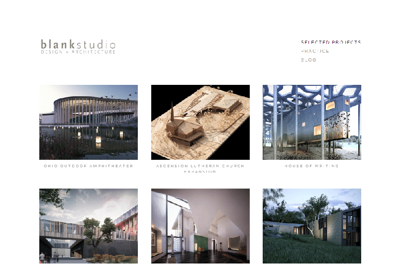
A clean layout is godliness. White spaces are needed to glorify category differentiations. Fonts should be displayed clearly across various platforms now that users are into multi-device browsing. This means while there is a need to omit needless things, functionality and usability must remain the designer’s top priorities.
Other advantages are evident in usability and rendering, which demonstrates the emphasis on UX when designing a website.
First, minimalist websites’ learning curve is not as steep as full-featured sites, making the users more comfortable and at home with the website. Using the platform is usually intuitive and natural. That is, the user would know what to do next instantly.
Second, the visitors will experience a platform that is easy on the eyes and extremely navigable. Minimalist websites typically load more quickly and allow a better content view. Quality contents will be useless if they are unreadable. This ties up with the layout requirement.
Disadvantages of minimalist web design
Now for the disadvantages. There may only be a few, especially if you are working on a well thought of and executed plan for minimalism, but to name one disadvantage is that what could happen should you try to exaggerate the simplicity and the minimalism in your website down to a level of extreme sparseness where your website not only looks unfinished but empty, cheap or have nothing much to say.
However, this may be avoided even on the most minimalist websites through the use of stylish touches and a good dose of rich content.
Another possible disadvantage of minimalist designs is their potential to be insufficient for your needs when your site grows. Your needs may be vastly different back then than to how it is now. However, this can easily be avoided if you planned when you started your design.
Simple sites are not exactly inflexible. You can avoid the problem of insufficiency in site functionality by building elegant minimalism over a heavy duty website framework that can be scaled up as you progress.
In a nutshell, the minimalist design reduces clutter. While it cannot make all elements standout, it helps eliminate background noises or those that divert the attention of the users away from the most important areas.
How to achieve a minimalist web design
Now let’s get to our main topic – how you can achieve minimalism. Here are the core principles to implement.
1) Embrace flat design
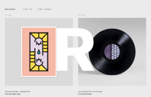
Flat designs are mostly characterized by the lack of effects such as drop shadows and gradients, although the designs use bold, vibrant colors. Most of the elements in a flat design are in 2D. In particular, the typography of headline fonts lacks texture.
2) Integrate white space
White spaces are incorporated as breathers. White space, nonetheless, doesn’t represent emptiness. Instead, these spaces signal as distraction-free viewing as possible while also guiding the user to where they should go next on the page. The white space is an alternative for unnecessary design elements that should be omitted in the first place.
3) Minimize choices
Choices impede the main goal of any website, which is to convert. Too many choices are only distracting the users. With fewer choices, the site can make it clear what the visitor should do next to proceed. The users will be allowed to continue or not given the choices.
4) Simplify navigation
Minimizing the choices doesn’t mean removing the navigation menu altogether. The navigation menu shouldn’t be intrusive in anyhow, and it must blend with the background discreetly yet should still be functional. Possibly, there should be no additional or different navigation layers that can only distract the viewing experience.
5) Integrate bold typography
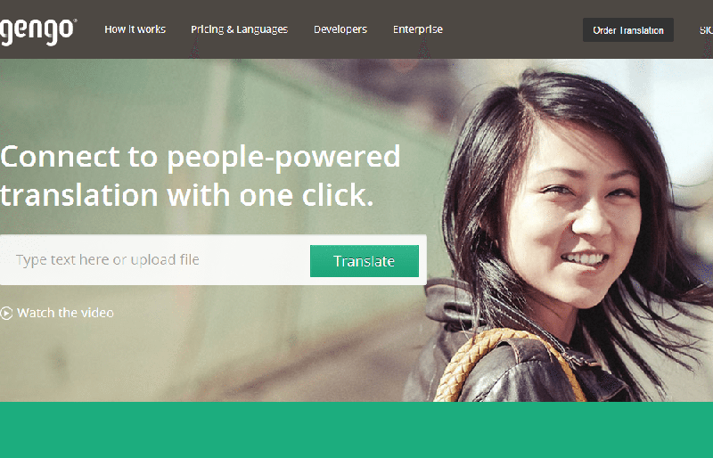
Bold typographies are straight to the point. Only the most necessary elements, such as fonts and font sizes, are used in designing a site, for instance, since typographies are used in place of images. Even without an image, the website will still have graphic interest in the eyes of the viewers. The only thing to consider is the functionality since graphical elements can affect the site’s functionality and usability.
6) Lessen colors
Colors hint at which elements are the most important on any given web page. Choose only the appropriate accent colors vital in imparting the message. Be mindful of the meaning of your chosen colors and how each color blends.
7) Introduce patterns
Subtle backgrounds, even with bold images, also promote visual interest without overwhelming the visitor. Simple grids can also be used to make a bare design more orderly. There is no limit to what patterns can be used, but make sure that the patterns are not intrusive and distractive.
8) Evoke emotion
Even the minute details count, but leave only those details that would impart how you want your visitors to feel when they land onto the site. Based mainly on the details, a website can be reserved yet sophisticated, funky yet modern, elegant yet refined, etc.
The more designs we learn, the greater our preference for simplicity. In the complex world we live in, nothing is ever simple. Nonetheless, we cannot abandon simplicity thanks to minimalist design. Web designers need not be apprehensive about the term ‘minimalism’ because nothing is unattractive with the examples above. Done right, a minimalist web design can contribute greatly to making the site the web’s next success story.




Comments are closed.