The use of mobile devices grows steadily over the years. Businesses, online and offline, continually realize the value of this ongoing trend. How mobility influences both–brands and users–would only expand further. Also, in this digital age wherein the numbers of mobile devices surpass the numbers of desktops, it is irresponsible to deliberate ignore mobile optimization or simply, mobile SEO.
Mobile SEO definition
SEO stands for search engine optimization. With this in mind, it would be easier to understand the concept behind mobile SEO. Mobile SEO is the process of optimizing the website to make it more accessible on mobile devices such as smartphones and tablets. It presents an opportunity for the websites to outrank the competition.
Importance of mobile SEO
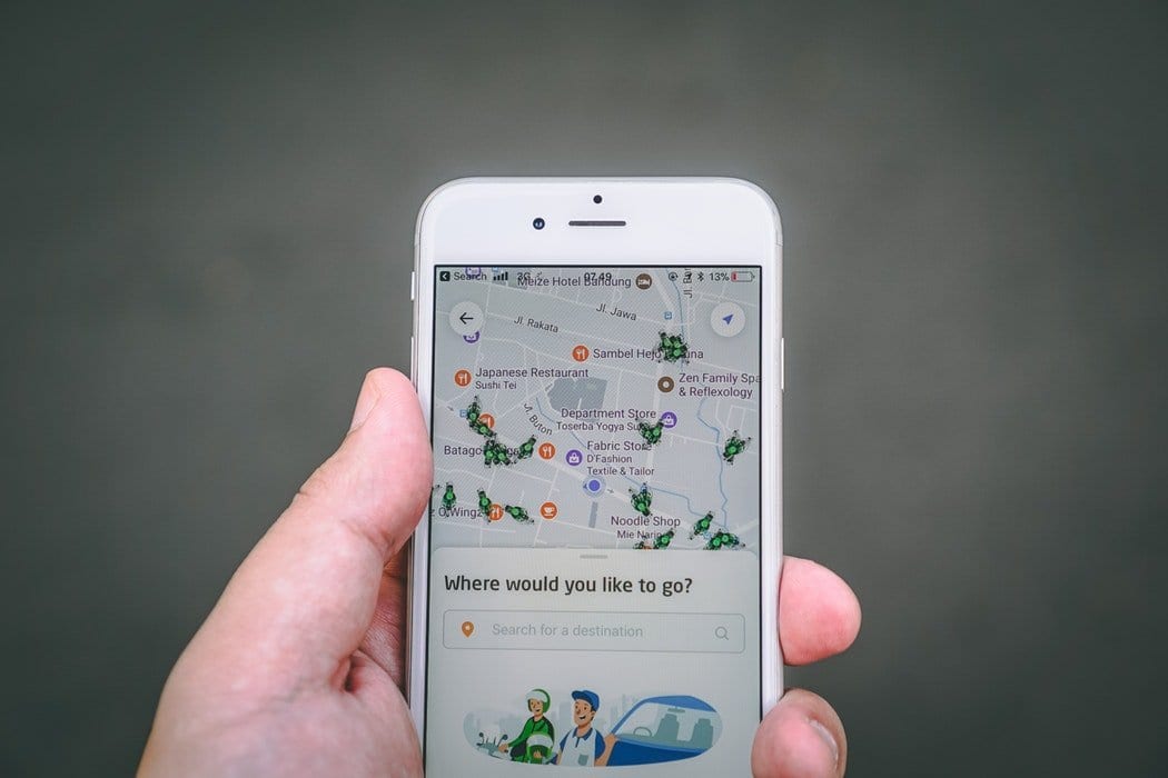
Mobile search
Google’s mobile-first index
Google, on the other hand, is consistently monitoring mobile progress. And in 2018, it prioritized mobile-first indexing. It refers to predominantly using the mobile versions of the content when indexing and ranking websites and pages.
Google uses desktop versions until this update was implemented.
Mobile SEO factors
Mobile SEO can be broken down into three broad optimization initiatives: technical, user experience (UX), and content. Of course, other equally important ranking signals must not be neglected.
Technical factors
Speed
Users have expectations, and mobile users are no exemption. In fact, they expect a lot from the world wide web. Mobile users are the most – due to the lack of a much better term – impatient users. Did you know that the average page loading speed of websites in the top 10 of Google SERPs is 1.10 seconds? The slower your website is, the deeper it will be on the results pages.
While at it, this is also Google’s main target that’s why they roll out the mobile-first indexing update. Another important case to consider: a user would close the tab if it takes 3 seconds or more to load.

AMP
Code-heavy websites also affect speed and, definitely, other technical factors. Accelerated mobile pages or AMP is the key to making heavy sites load faster, loading than 30x faster than the previous version.
AMP-powered websites and pages tend to rank higher on SERPs because of speed. Click-through rates are also higher among these pages than their regular page counterparts.
UX factors
Unordered lists
As experts suggest, breaking down content into sizable chunks is much better more so because the people are using mobile devices anywhere and everywhere possible. It means if they can consume content in tidbits, the better.
Google rewards neatly organized mobile content. It’s because of the limited screen real estate that brands need to maximize so only the most relevant content is displayed to the users. If it means listicles and bulleted content, then so be it.
Rankings will diminish if there are ‘noise’ and other elements that should have made into the mobile version initially. For mobile devices, the secret is 9 bullets at a time.

Images
Images contribute to both form and function. And this can be true too for mobile SEO. Images, hi-res especially, are pleasing to the eyes. Nonetheless, they tend to have better recall compared to pure text. They leave a more lasting impression since they can be perceived easier.
Done right, images may contribute to having a better UX. Done right is the aspect to remember. Why? The answer is it’s rather easy to forget how content such as images can bloat bandwidth and render the page slower. This negates the goal of providing the experience we want our users to have.
The rule of thumb is to optimize the images to reduce its file size. Also, using several images is not a good idea. About 4 images per year will do. Don’t forget the descriptive filename, short yet relevant caption, and alt text. Bots cannot read images but text, remember?
Internal links
While it is advisable for desktop versions to include several relevant internal links, this cannot be said for mobile versions. Mobile pages have 75% fewer links because of the inherent limitations of the screen.
If you need to put interactive elements such as internal links, make sure that you placed only the most relevant ones. Placing the links too close to one another is not advisable, though.
Content factors
Keywords
One problem with mobile pages is the tendency to underoptimize them due to the inherent limitations from the screen size to the fewer interactive elements you can put into it. Content, nonetheless, can never be taken out. Putting keywords to the body is highly recommended.
Long-form content is an opportunity to put as many keywords on your mobile page. But the goal should be keeping it as natural as possible.

Word count
But since this is mobile we are talking about, some users may frown upon seeing long-forms. As such, tailor your content – word count aside – with the mobile screen standards that your target audience is using.
Also, please remember that anything beyond the 700-word count is considered as long-form; well, at least, when mobile devices are used. Chunk, bite-sized content, right?
Additional factors
Social signals
Like traditional SEO, mobile SEO also includes engagement on social platforms as a ranking signal. And, it makes perfect sense optimizing mobile pages in conjunction with optimizing social profiles or pages.
Engagement has a trickle-down effect wherein the social proofs such as numbers of shares, likes, comments, retweets – the overall engagement boost ranking. It’s because social proofs 1) highlight the brand’s credibility and 2) make the brand authentic. No one wants to deal with a ripoff, definitely, especially today whereby fake and phishing sites are all over the Internet.
Local SEO
Mobile SEO is implemented because of the high accessibility of information, thanks to the growth of assistants, voice search, and intent-based searches. For sure, you’ve searched for “restaurants near me.”
Failing to optimize the pages based on location would mean failing to capture this market share. Don’t be fooled by the fact that mobile has only 16% conversion rates compared to 26% on desktop. It’s because users would still want to complete a transaction on a bigger screen.
While at it, users searching for restaurants do not always disclose that they end up eating at any one of those nearby restaurants. Then again, local SEO is too important a factor to ignore.
Mobile SEO practices
Page speed
- Optimize the images
- Keep page speed scores at 85 above
- Keep page loading speed at 3 seconds or less
- Implement Google’s speed recommendations
Mobile design
- Make the website mobile-friendly
- Implement Google fixes prudently
- Address the technical side
- Don’t use flash and/or pop-ups
- Design for the fat finger
HTML
- Optimize title tags for mobile SERPs
- Optimize the description as well
- Use schema structured data
Mobile SEO Tools

Free and freemium tools are available online to help you with your mobile SEO goals. Some of these tools are below.
- Mobile-friendly test – The tool helps you determine whether visitors can use the page seamlessly on various mobile devices. All you need to do is supply your URL on the field.
- Google Search Console – If you want to check crawl errors on both desktop and smartphones, this tool will help.
- SEMrush – As a site audit tool, this can also help identify various crawl errors and how to fix those errors.
Learn how Optimind can help AMP up your mobile strategy. Talk to us!