Calls to action present themselves as opportunities to escalate profitability and widen reach. While they are usually in tiny button formats, they serve as gatekeepers allowing the users to access the critical parts of the sites. These parts are where conversion happens. Calls to action are fundamental parts of web design in the Philippines and other parts of the globe. Web designers themselves must know what makes CTAs click, so it will be clicked by your users. On the other hand, it is always worth it to learn a thing or two about calls to action designs. They are not just buttons. Here some factors to consider how such buttons should look.
Appearance
Conversion happens when there is a high level of interaction with at least a call to action within the website. Interaction is only possible, nonetheless, if there are visually noticeable calls to action. When designing a call to action, here are the most important elements to look at.
Shape
Calls to action buttons are the digital versions of actual buttons. These buttons are actionable wherein an action may produce the desired results. Imagine a doorbell. What happens when you press it? Such action and reaction relationship must be transferred to the design of the CTA button.
Rounded rectangle is considered to be the best shape for the call to action. We, humans, are programmed to avoid sharp edges since they require more cognitive effort compared to rounded shapes which need a single visual motion. These edges are regarded as probable threats as well. The rounded corners are pointing inward which draw the viewer to look at the content of the button. This is the direct opposite of straight edges which point the viewer outward and away from the CTA content.
With all these, it is easier to conceptualize a circular call to action button. Circular buttons are not as popular as rounded rectangles though. Rounded rectangles are used online since 1981 hence we are more accustomed to it than the circular ones. You can experiment to see which shape works best for your site.
Size
Sizes of calls to action greatly impact the conversion rate. The buttons must not be too small, or it will fail to stand out. Also, the buttons should not be too big that they distract the users from finding the information they are actually looking for. With this, the user will only be discouraged to continue with exploring the site. The user may also get the impression that the button is not clickable.
While size matters, understand that it is a relative concept. This means that the size of the button must relate to the sizes of the other elements surrounding it. There are no perfect CTA button dimensions. Striking a balance is key here.
Continue experimenting until you find the right size. The actions required must inform the size of the button accordingly. The rule of thumb is more actions are for bigger CTA buttons while fewer actions are for smaller CTA buttons.
Color
Overall appearance of the call of the action is mainly attributed to its color. In choosing the right colors for your CTA button, you may refer to the complementary approach or psychology approach. The first approach involves consulting the color wheel chart. Complementary colors are colors directly across one another. Complementary colors emphasize contrast, and yet work good together when paired.
With this approach, the philosophy is choosing complementary colors that contrast from the rest of the web page, so the CTA button will stand out. The button will be the first element that the user will see. If the colors are too bold for your website, you may further look for the right color combinations to go with the dominant color of your website.
The second approach draws inspiration from the meaning behind the colors, appealing to the mind rather than the eyes. Studies showed that colors evoke various emotional responses. Thereby, colors associated with your brand that create positive emotional responses must be used. Through enabling experiences, you can increase positive perceptions about the brand as well as conversion rates.
As much as possible, reflect the colors of your brand especially those that are visible on logos. Just make sure that the call to action button will be noticeable in any given web page. If the brand doesn’t have any color scheme, now is the perfect time to start color association.
Be reminded also that the size of the button affects the color(s) of such. Bigger CTA buttons must use less prominent colors and smaller CTA buttons should use brighter colors.
The most commonly used colors of calls to action are:
RED
Associations: money, attention, stop
Benefits: grabs attention
Color red evokes strong emotions. Red is commonly known for its intensity and urgency. Red CTA buttons therefore are highly effective among impulsive buyers.

ORANGE
Associations: cheapness, value
Benefits: bright without being too aggressive
Color orange reflects enthusiasm and excitement. Orange represents approachable and confident brands, but it can sometimes indicate aggressiveness.

YELLOW
Associations: happiness, childhood
Benefits: first color to be seen
Color yellow is a happy color. Yellow increases optimism and cheerfulness. It also stimulates mental processes. Yellow also grabs attention and encourages communication.
GREEN
Associations: environment, safety, calmness
Benefits: appropriate for reassurance
Color green symbolizes growth and serenity. It causes relaxation. It doesn’t strain the eyes.

BLUE
Associations: professional, social, truth
Benefits: reconsider actions
Color blue conveys security and trust. It also represents calmness. The color increases productivity as well. Color blue is mostly preferred by the male audience.
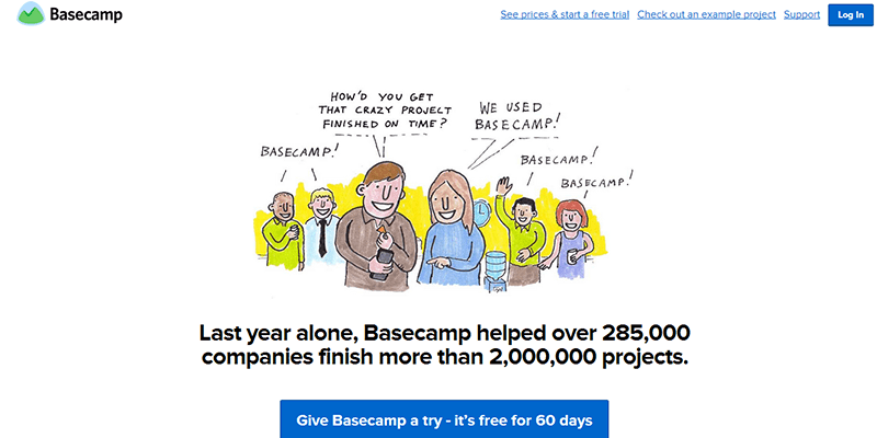
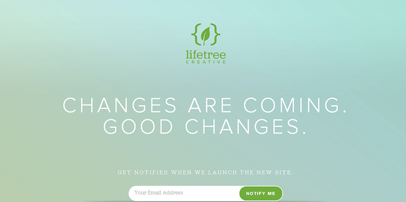
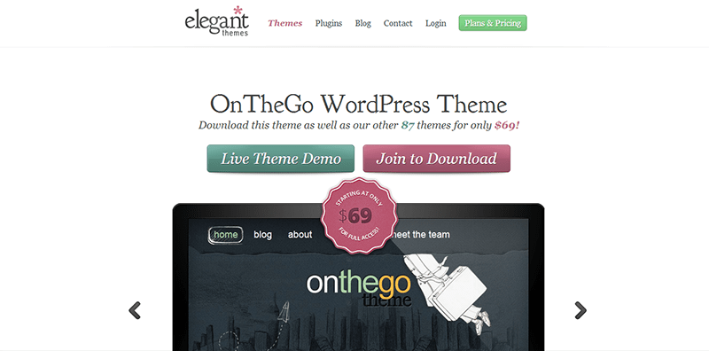
Here are other calls to action with nice color combinations of CTA buttons.

Language
Regardless of how visually appealing your CTA buttons are, they may be useless unless they include the right wordings. For one, it should be clear to the users what actions are needed from them. Not only the terms it used, but also the overall tone of the CTA in getting the message across can influence conversion. Calls to action must be motivational in nature.
Language don’ts
- Using CTA clichés (Submit, Read More, Next, etc.)
- Rushing emotional commitment
- Rushing purchase commitments (Pay Now, Buy Now, etc.)
- Using elegant (un-relatable) wordings
- Scaring users away (while still on the middle of sales funnel)
Language do’s
- Writing concise and conversion-driving words
- Establishing urgency without rushing commitment (Contact us for more info)
- Using action-based words (Download free e-book, Subscribe to our newsletter)
- Starting with a clear verb identifying what the user should do
- Identifying user benefits (Increase your productivity now, To a sexier you, Getting better night’s sleep, etc.)
Remember that users are reluctant to register and give information especially when the action requires the users to spend some time in doing the said action. Make sure that the user understands the words. Appeal to the customers, so you’d gain their trust early on in the conversion process. Don’t mislead the users or they will lose faith in your website.
Position
After the appearance and language, the placement of the CTA button is also critical. The button must be prominently placed and surrounded by whitespace to make it appear more visible with less clutter. It can be above or below the fold, but definitely not on the footer. Remember that more than 80% of the site’s users will not scroll down below the fold. Those who will browse beyond the fold would interact with your site and its contents.
Place the CTA button below the contents. However, make sure that the contents have the right amount and of high quality. Make the copy as persuasive and informative as possible. Through this, you can justify the need to click the button before asking the user to commit.
In sum, calls to action must not be treated as simple buttons. Instead, they should be treated equally as other elements of the website and its pages. Aside from its overall appearance, web designers must know what the CTAs must say and where they should be found. Through this, the web designer may maximize the appeals of the calls to action to as many users.


