Believe it or not, but your customers are willing and ready to connect with you on different screens regardless of its type and size. Definitely, a huge opportunity waiting to be seized! However, this is only possible if you are also willing and ready to give your customers what they want. That is, viewing your site on screens as small as smartphones and as wide as tablets.
Indeed, websites should fit the needs of the consumers. Multi-screen is often the missing piece of responsiveness, which should not be the case. Here’s how multi-screen should fit your business objectives while giving your customers what they really, really want.
What Google says
Before we move on to the steps in redesigning a website for multi-screen purposes, let’s take a look at the statistics.
In 2012, Google, together with Ipsos and Sterling Brands, conducted a study that dramatically changed how websites should approach responsiveness. The study dug deeper into how the US consumers interact with media on a daily basis. Google discovered that:
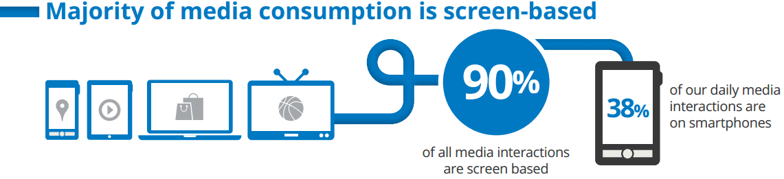
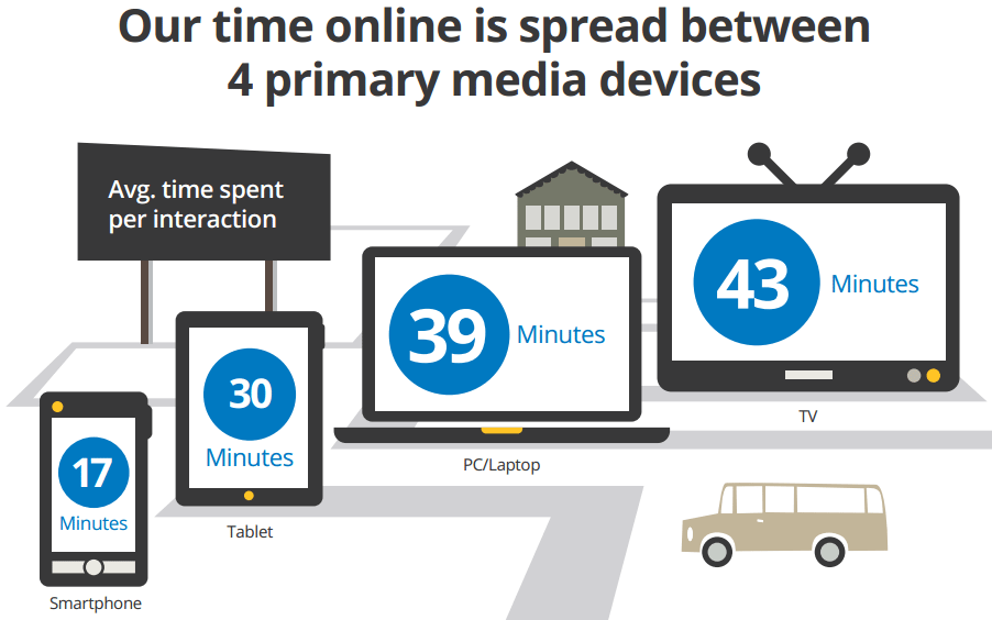
On average, we are spending 4.4 hours in front of screens daily. Our time spent is spread on four major types of devices namely smartphones, tablets, laptops/desktops and television. Nevertheless, television no longer commands our full attention.
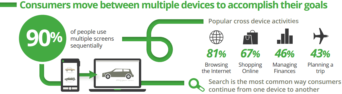
Our device (or screen) of choice is contextual. Time, goal, location and attitude affects our choice of device. For instance, we use computers to find information and keep us up-to-date, we use smartphones to keep us connected and tablets to keep us entertained.
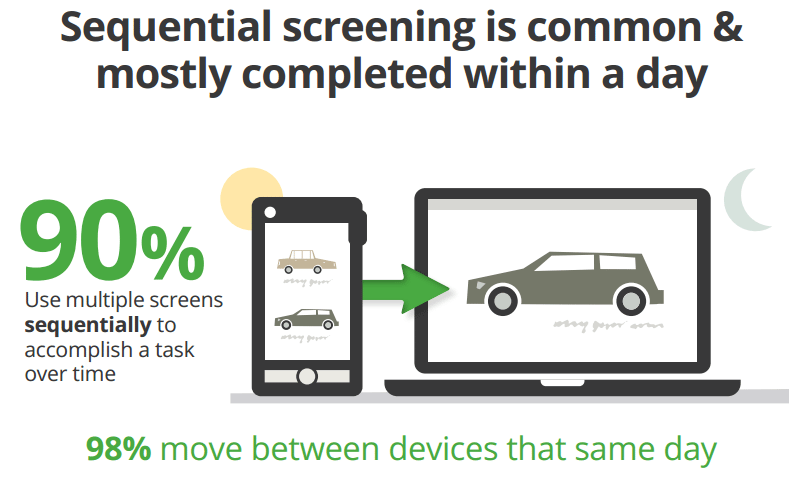
We multi-screen either sequentially or simultaneously. We move from device to device throughout the day to accomplish the task on hand. Or, we use various devices at the same time for both related and unrelated activities.
What constant connectivity teaches us
Constant connectivity breeds new opportunities on how to reach the multi-screen consumers.
For these consumers, looking at multiple screens is a reality. They will reach for the handiest and most convenient device for them at the moment. They expect that the device, what it is that they are using, will work for them. This is more so for screens with wider space.
For businesses, this means having a website that is multi-screen-friendly is a must. There should be an overall multi-screen strategy that fits the needs of the consumers. Device browsing is an experience in itself that websites should not ignore. The question now is how will you go about redesigning for multi-screen-friendliness.
Here’s how.
1) Embrace the multi-screen idea
Importantly, you should know what multi-screen is and how it fits your business goals. What do you expect to get from it? What can your consumers expect if you go multi-screen? The value proposition for the users must be evident otherwise the move to transition will only be self-serving.
To understand your multi-screen consumers more deeply, integrate analytics in the equation. What devices are they using? What are they doing on your website through these devices? The answers to these questions are the foundation of the multi-screen strategy roadmap. Whatever it is, don’t forget to create familiar experiences from desktop screens to other screens and think about the user’s context.
Be reminded that we are transitioning into a mobile-first world. Do not you think that the other screens other than desktop displays are just extra screens. Not ever! Instead, think of it this way: mobile screens are the only screen that your consumers see. So, make sure that the website has full capabilities when viewed on different screens.
2) Select the right technology
There are many a ways in redesigning the website for all screens possible. Nevertheless, your brand and business’s unique requirements should inform the best approach to use. Also, aside from customer needs, important factors to consider as cost, time to build, infrastructure and manpower.
Regardless of the chosen approach, the underlying principle is serving the sites using a single domain. If your main website is mywebsite.com, do not redesign or build a new website with a separate domain such as mywebsite.com/mobile. This will only confuse your users and, brand and URL equity will not be achieved.
Responsive design
Responsive web design Philippines is a technique that makes use of an HTML code for different platforms. The devices used in viewing the site will read from that code alone. With this, the contents will resize so that they will fit the screen being used.
Such approach is resource-intensive, but the device-specific technique has several pros. These are a single URL for all contents and more streamlined UX (user experience). There will be flexible orientations but with no redirects.
A common mistake to avoid is data bloat. For instance, there may be images suitable for bigger screens. Optimized the image files and load the most important contents first.
Dynamic serving
Dynamic serving is a method wherein the server detects the kind of device being used prior to presenting the user a custom page suitable for that device. As such, the user will get a custom UX with contents and layout created for the device.
While the page may load faster using a single URL, there is a possibility of content forking. Since there are various versions of custom pages, there will be various sets of the same contents. Keeping contents up-to-date particularly on device-specific pages will be a challenge.
Further, make sure that the server can detect different devices. Keep the scripts up-to-date as well, so that the server will render the page for the right device in the right orientation (i.e. portrait and landscape). The brand must be recognizable even if the users are browsing on different devices.
Mobile-only site
You have a third option, and that is building a separate mobile website. The system will detect mobile visitors and redirect them on the mobile-optimized site (could be m.mywebsite.com). Through this process, only the visitors using mobile devices can see the mobile-intended website.
One of the problems with this option, however, is the UX inconsistency. This can get confusing even if there are same elements present on the desktop-intended sites.
In redesigning for multi-screen availability, there is no one size fits all. Aside from understanding your business needs, you also have to understand who your users are, what device they are using and for what purposes. Several important factors will come into play, but of course, you know so well that your business deserves the best. It is no longer a question whether to go multi-screen or not. Instead, a multi-screen strategy may be what you really, really need to succeed with your constantly connected customers.
Sources: Google User Content | RickWhittington.com | Google Mobile Ads Blog
Image credits: Google Mobile Ads Blog