Any web design company Philippines would know what white space is. If done right, white space can benefit the design in many ways. Don’t reduce white space. Instead, put as much white space as strategically possible. Below are some of the benefits. Before we proceed to the benefits though, we might as well revisit the definition of white space.
White space defined
For the sake of the non-technicals, white space refers to the portion of a web page that is left unmarked. Meaning, white spaces don’t have any gutter, margin or space between objects, columns, figures and graphics. Also called negative space, however, white spaces need not be white. Empty spaces surrounding specific page elements can also be considered as white spaces.
Further, negative spaces come in various forms. Examples are spaces between images. These spaces are made of ‘nothing’ as it seems in the sense that no design element is actually occupying the space. However, it is in this sense that the white space must not be treated as ‘useless.’ Not because there is nothing, it should be regarded as such otherwise you will miss the opportunity to design a truly visually appealing page.
Benefits of white space
White space plays a crucial role in the visual layout of any web page. The same also rings true with brand positioning. Nonetheless, white space is also responsible for element prioritization.
1) White space highlights luxury
Nowadays, more white space means more luxurious brand. Paying for website real estate is costly. Not to mention, screen limits allocated for brand messaging. So, website owners instruct designers to use the available space as possible. On the other end, un-cluttering space leads to crafting better brand messages on more restrictive spaces.
Further, websites with more white spaces are perceived to have contents that are more vital than the screen space. Any brand may appear luxurious since it can sacrifice more screen spaces in exchange for more focused content messaging. The white space creates a feeling of elegance and sophistication. This is known as the precise effect, and more and more luxury brands are embracing such.
2) White space makes color more vivid
White space makes other colors pop. This is required for grabbing the attention of the visitors. Making the colors seemed brighter than usual, white space accentuates the richness, depth and intensity of the chosen palette.
With just the right amount of white space, sparse use of a limited number of colors is possible. In fact, using only one color against your white or empty background is also acceptable nowadays. Called the minimalist color approach, solid colors such as red, blue, green and orange create an effect that is well-focused and pleasant. Users may appreciate the simplicity all the more because of the judicious use of color.
3) White space boosts legibility and readability
White space paves the way for a more comfortable reading experience. White space acts as a buffer that gives the texts just the right space between them to make them readable. Thus, texts will be easier to scan and comprehend unlike when the page is cluttered with too many elements that it gets confusing to the human eye. A Wichita State University lab research revealed that, while white space may decrease reading it, it improves reading comprehension.
White space can also break the page contents in section to improve both the reading experience and information absorption. So, it guides the users when on the page from one part to another, bringing the most important elements into focus. Just the same, white space can put emphasis on the most important contents or the contents that the viewer should be reading in actuality.
4) White space promotes smooth search
White space demonstrates effective simplicity. If there is one company that understands the importance of white space that is Google. Its search platform has no loud background and annoying ads whatsoever. White space dominates with the search bar right in the middle of the page as if telling the user that the page is used for such purpose alone.
True enough, white space can draw the viewer to certain areas where he or she should be practically looking at. The use of white space can emphasize the next appropriate action on the part of the viewer. This is especially true because of the contrast effect. Any color overlaid on white space stands out particularly the colored call to action button. Simply, white space allows prioritizing the most important user interface elements.
The web designer’s goal
When designing a website, the goal should be delivering a great product always. No matter what elements will be included in the design, ensuring that positive overall user experience is achieved is an absolute must. Using white space, for one, is important for a smoother and clearer navigation. This is not only because of conversion, ut also about building loyal and raving customers.
The job of the designer is to make a website that is simple and uncluttered. Unless the web designer can do this, your website will only be just another site that pollutes the web. The right person for the job knows how to develop easy-on-the-eyes layouts that make users want to keep exploring the site. Simple designs should be created despite the complex processes involved in doing so.
White space must be used in a way that it improves the overall design. It is an opportunity to showcase what is truly important to the users, and not necessarily the brand’s owners. Taking advantage of the available space doesn’t necessarily mean to put all the elements on the page. Put only what are necessary.
Some examples
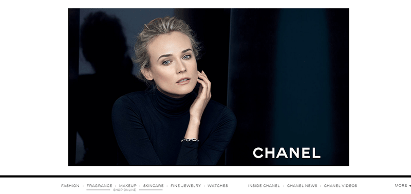
Chanel
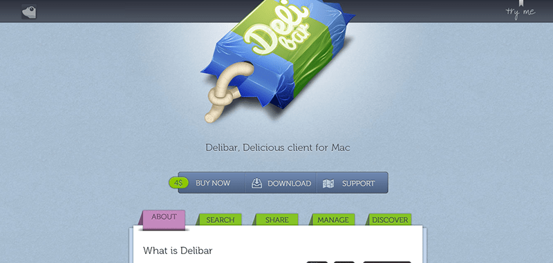
Deli Bar App
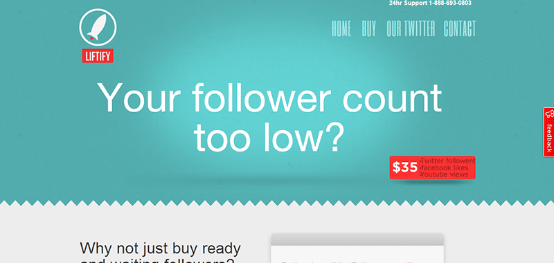
Lifify
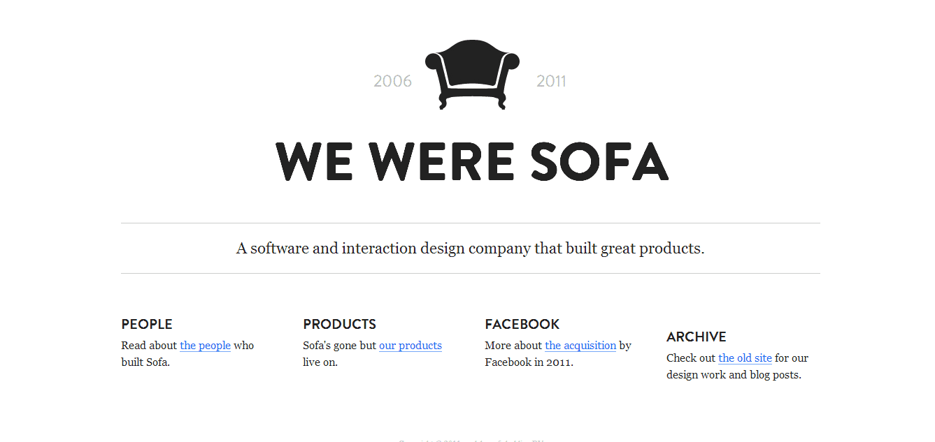
Made by Sofa
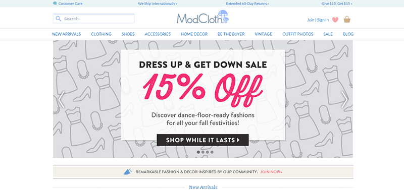
Mod Cloth
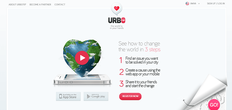
Urbotip
Ultimately, we can say that white space is not necessarily wasted space because there is nothing there. For the designers, perhaps, this is the perfect time to move away from cramming the most number of elements and colors into any given page space when designing a website. White space has a powerful impact. Less is really more when applying the concept of white space. This is a trend that will never get out of style. Not in the near future!


