Persuading consumers to buy is not without difficulties. It’s a blessing that there are theories and concepts to guide marketers, one of which is color psychology. Unfortunately, even this outlook is considered interesting yet controversial, at least in persuasive marketing.
And the reason? The advertisers themselves cannot make sense of aligning colors with the mental models of the consumers. When they were able to apply the concept, the implementation is mostly based on ‘uneducated guesses.’
Color psychology is a fascinating facet of our behavior. To further understand and build on the importance of promoting brands online, we will discuss various published research on persuasion and color theory along with the foundations laid by Gregory Ciotti, a Marketing Strategist at entrepreneur.com.
Applying the psychology of color in digital marketing
Digital marketers need to exhaust all strategies to ensure that all marketing collaterals are geared toward generating sales, increasing conversions, and cultivating loyalty. The choice is brand colors is one of these marketing strategies.
Unfortunately, even some digital marketing agencies themselves are not taking this matter seriously when, in fact, an appropriate color combination aids in building a stronger and more reliable brand. There are two things to consider here. First, colors help in connecting with the target market. Second, they help in making the brand stand out from an ever-crowded digital marketplace.
Bottom-line, you need to choose colors that truly represent the brand, especially its vision, ideals, and aspirations. When choosing brand colors, ask yourself: How do you want your customers to feel when browsing your website?
Speaking of websites, web design also heavily relies on color psychology.
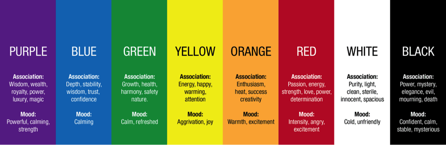
Below is an example of how users associate with colors and what mood certain colors evoke.
Misconceptions about color psychology
Further, we should discuss the misconceptions about color psychology.
Come to think of it, why does such a concept invokes a lot of debates and conversations online and off, and yet there are so few pieces of evidence or factual data to back it?
Such shreds of evidence are hard to come by due to our preferences, experiences, cultural differences, and contexts that muddy how colors affect each of us.
As such, universally translating our perceptions of colors into concrete feelings will prove to be difficult. The reason behind such is that an individual’s experience with certain objects determines how that individual feels about the colors of those objects.
Across cultures, there may be general trends when it comes to color preferences. However, a wide gap exists among individuals’ color preferences even when they belong to the same culture.
Yet another research pointed out the controversial color associations.
- Orange – upset, disturbed, distressed, cheapness, sensuality, and paganism
- Black – passivity, sadness, and expensiveness
- Gray – passivity
- Brown – sadness
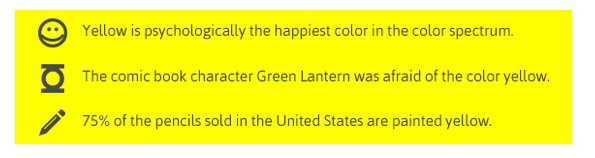
Bland visuals such as those below are also not helping the conversations. In fact, some visuals claim truths behind color psychology without verifying the ‘truthiness’ behind such claims.
We cannot associate colors with how a person perceives a brand or product more so emotionally because of our inherent differences in simpler terms. It’s suicide even to attempt.
Now, here’s the fortunate part. Some researchers offer concrete evidence of the role of color in persuading multifaceted consumers.
Importance of colors in branding
Before we proceed, though, we should understand the importance of colors in branding.
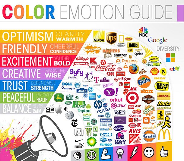
Branding is the most important issue when it comes to color perceptions. The Logo Company publishes its color emotion guide in classifying how a certain consumer responds to individual colors.
Thereby, targeting logo colors is paramount, specifically for the new brands. Remarkable colors will make the brand more prominent among the pool of rivals. Put simply, when everyone’s into blue, go purple.
When it comes to logo design, the choice of colors speaks of the brand’s identity and personality. Definitely, the brain prefers recognizable brands. And what better way to do just that than infusing the right colors from the logo into other marketing collaterals?
Below are what logo colors mean.
Color perceptions are also about the perceived relevance and suitability of the chosen color(s) for a brand or product. Consumers form a mental notion of whether the color or colors of the product ‘fit’ what is actually being sold. Thereby, color has an inherent value when it comes to branding.
Color perceptions present deeper marketing-related patterns not just in branding but also in purchasing.
A study about how color impacts marketing reveals that about 90% of the respondents make snap judgments about a product based on its color. Interestingly, the sensible use of colors contributes to product differentiation and influences feelings, moods, and attitudes toward a particular product.
How a consumer forms a reaction to the point of purchase (POP) displays is also influenced by the display’s dominant color. Displays with blue or green background colors attract the most attention, while displays with white background colors attract the least attention.
Another study confirms that intents to purchase are affected by colors based on the impact of a consumer’s brand perception. Consumers are tended to associate colors with the brand personality. Think of Harley Davidson. Aren’t the motorcycles cool and rugged?
When picking the right color of the brand or products and their packaging, remember color appropriateness. For the consumers, this is more important. Think of it this way: do you think Harley-Davidson will sell a pink, glittery Harley ever? Not!
Brand personality has at least five dimensions that come into play. These dimensions that Professor Jennifer Aaker noted are Sincerity, Excitement, Competence, Sophistication, and Ruggedness. Harley Davidson, obviously, fits the fifth dimension as it portrays tough and strong attributes.
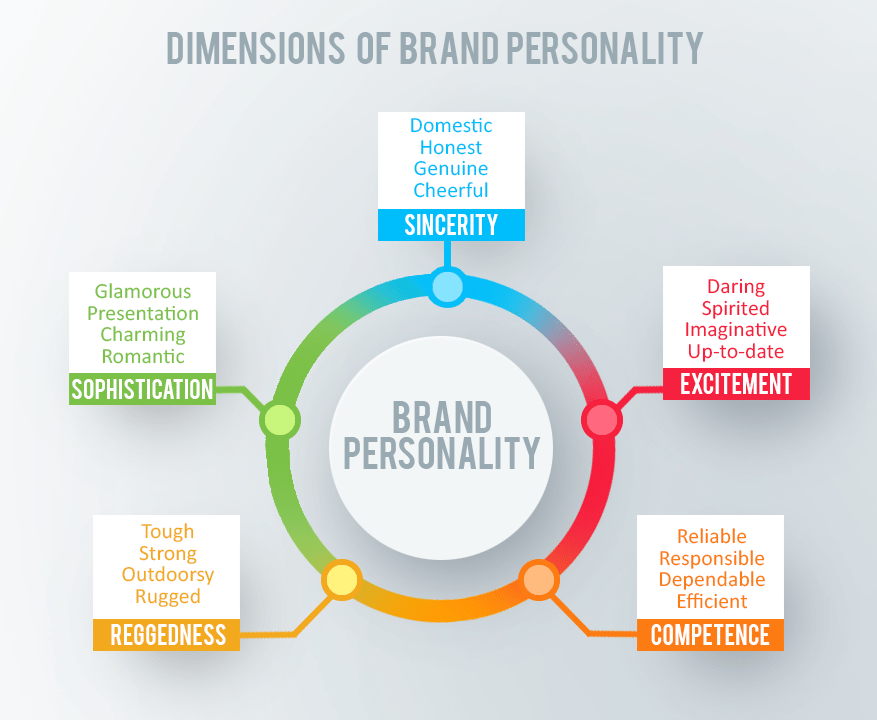
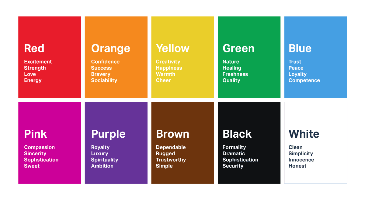
There are specific colors that can be broadly aligned with various traits. For instance, red is commonly associated with excitement and liveliness. However, you must choose a color that supports your brand’s personality rather than select based on stereotypical color associations.
Green is often associated with calmness, right? However, green is also commonly used to refer to the environment. Take brown as another example. Brown is associated with ruggedness, and yet it is also related to warmth, like the way we see brown in chocolate commercials.
Needless to say, while there are no straightforward guidelines in choosing a brand color(s), color is a critical aspect of branding. We, consumers, create a brand identity based on their colors. Marketers read: the human brain responds better to brand names.
The brand creates moods and feelings that directly relate to persuasion. Apple uses white to communicate its affinity for simple and clean designs. So, determine what emotions you are trying to evoke when choosing a brand color. Perhaps, this Wheel of Emotions may help you decide:

In this context, red may spark excitement, but it also diminishes analytical thinking. Reflect on this simple stance in choosing the right color for your brand.
Our color preferences greatly vary by gender and other factors such as age and environment.
Aside from the perceived color appropriateness, gender also plays a great role. Have you seen a purple or pink power tool? You haven’t, right? Me, too.
Hallock, in his color assignment study, noted that three things determine our color preferences:
- How an individual feels in any given situation
- How that individual wants to feel
- How that individual remembers specific experiences
These things are very subjective; that’s why we have to look at the cultural perceptions of how we, in turn, perceive colors and their effects on us. Culture dictates color appropriateness for males and females, that eventually affects individual choices.
Here are our favorite colors based on gender:
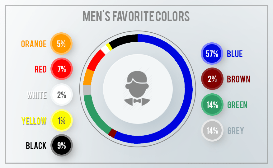
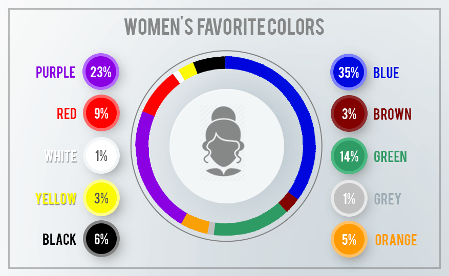
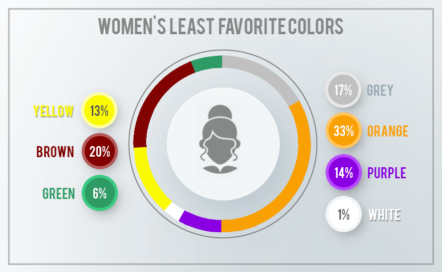
Notice the dominance of the color blue in both genders. There is also a lack of preference for the color purple among men. This explains why we haven’t seen a purple jigsaw or drill. Also, purple is not favored by older people. The same goes for yellow.
Another great work deals with how pink became the color of femininity while blue is the color of masculinity. It was only until Time magazine printed a chart in 1927 that showed gender-appropriate colors based on US-based clothing stores’ sales. This tells us that color preferences, while primarily cultural, change along with history and the dominant subculture’s preferences during that period.
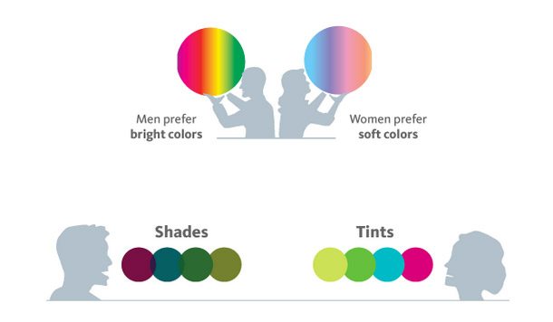
KISSmetric also published an infographic to show the wide disparity of the color preferences of men and women. Bold colors are for men, while softer colors are for women. Men choose shades, while women choose tints.
As published in Wired, even how we refer to a color differs culturally.
Keep the color preferences by gender and culture when choosing a brand color. There are unambiguously different preferences. Pick a color that appeals more to women or men, depending on which gender makes up a bigger percentage of your prospects.
There is no best color for conversion. Also, there is no single color that converts a visitor into a paying customer.
Culture also dictates how we name colors. We love how ‘mocha’ sounds yet hate how ‘brown’ sounds and looks. We don’t just perceive colors differently. Our color-name perceptions also vary!
We prefer fancy color names despite being presented with objects of the same color. This is the most difficult part for firms that actually deal with colors, such as cosmetics and paint companies.
People also prefer unique and unusual color names. The more unique the color name is, the greater the purchase intent. This holds true for both food and non-food products.
Evidently, it would help if you chose creative and descriptive color names and memorable names to describe your brand or product’s colors. The goal is to make sure that the color and color names will achieve the biggest impact.
How we recognize and recall a brand and its color(s) is because of the isolation effect. Any person can remember an item better when it is very different from the rest. Consider this:

Notice how the red button stands out because of its red color, which completely contrasts with the blue background.
Some studies proved that people favor harmonious color combinations and small palette principles. This means that while there may be many different colors of products, the consumer will prefer a product with colors that perfectly blend, yet the choice of colors should be limited.
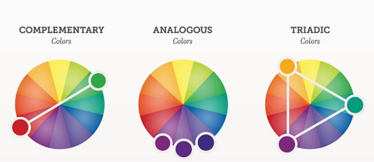
In place of color coordination, there might be a need to create visual structures. KISSmetrics emphasizes the art of color coordination. For instance, the brand logo must consist of base analogous colors and contrast them with accent complementary colors. Here are the analogous and triadic color combinations.
Creating a color hierarchy may also be considered, utilizing background colors in addition to base and accent colors. There are analogous and complementary color combinations, and then there are monochromatic combinations. This applies to both brands and corporate sites.

You may not realize this now, but color coordination matters much in conversion. However, when it comes to optimization and conversion, the color of buttons requiring actions is a matter of debate.
This button test proved that the button’s color psyches the audience to act on what they are seeing. Red won by 21%!

Remember that red is a complementary color to green. Apparently, green is the dominant color of the site. Red perfectly contrasts with the dominant color. This is where the role of visual contrast comes in.
That’s why it was clearly noted that you need not go with the stereotypes. If challenging the status quo is your thing, go ahead. Do so!
Here’s another perfect example of visual contrast (or isolation effect at work) and how it affects conversion—the number of downloads with the following prompt variations.

Before you scroll, take a good guess which combination produced the most downloads. #10 and followed by #9. They outperformed the others because of the contrast, not just in color but also in font size. Ultimately, it is clear what the users need to do (a clear call to action).
See how important color contrast is in conversions?

This study wants to tell us that the isolation effect must be considered when determining the color palette of your brand and your entire marketing collaterals. The choice of colors will guide the users into the most important action areas.


Comments are closed.